Have you ever stopped to ponder the hidden messages concealed within some of the world’s most recognizable logos? From subtle symbolism to clever visual tricks, these logos are more than meets the eye. Join us as we uncover the fascinating stories behind some popular logos with hidden meanings you probably missed.
The 9 Famous Logos with Hidden Meanings
What’s the Secret Behind These Iconic Logos?
Nike: Just Do It…with Hidden Symbolism
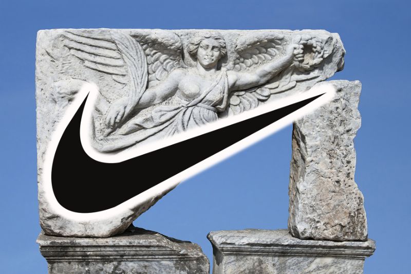
Ah, the Nike swoosh—the emblem of athletic prowess and determination. But did you know that there’s a deeper meaning behind this simple yet powerful logo? Designed by Carolyn Davidson in 1971 for just $35, the swoosh represents the wing of the Greek goddess of victory, Nike. It’s a symbol of movement, triumph, and the relentless pursuit of excellence. So, the next time you lace up your Nikes, remember you’re not just wearing shoes but embracing a symbol of victory.
Apple: Taking a Bite Out of Misconceptions
The Apple logo is a ubiquitous symbol of innovation and elegance. But what’s the story behind this iconic fruit with a missing bite? Contrary to popular belief, it’s not a nod to the biblical story of Adam and Eve. Instead, it pays homage to Sir Isaac Newton, the father of modern physics, who was inspired by an apple falling from a tree.
The missing bite? It’s simply a play on words—a byte, as in computer bytes, reflecting Apple’s pioneering role in the tech industry. So, take a byte out of knowledge and savor the hidden symbolism behind this fruity icon.
FedEx: More Than Meets the Eye
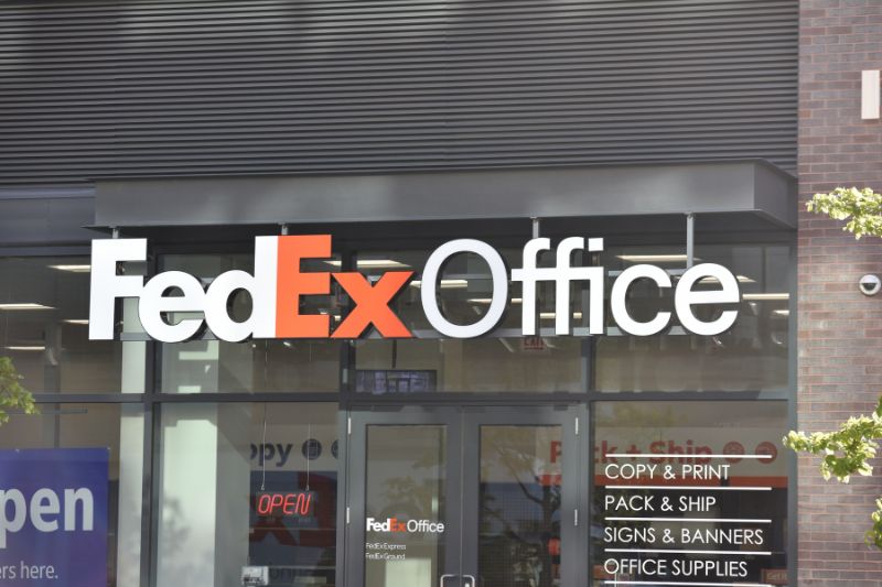
Ever noticed the arrow hidden within the FedEx logo? No? Well, prepare to have your mind blown! Designed by Lindon Leader in 1994, the FedEx logo isn’t just a collection of letters; it’s a cleverly crafted symbol of speed and precision. The white space between the “E” and the “x” forms a subtle arrow, representing the company’s commitment to delivering your packages swiftly and accurately. It’s a simple yet ingenious design that elevates the FedEx logo from ordinary to extraordinary.
Amazon: From A to Z, Literally

What do you see when you look at the Amazon logo? Most people notice the arrow, stretching from the letter “A” to the letter “Z,” symbolizing the company’s mission to provide everything from A to Z. But did you know that the arrow also forms a subtle smile? That’s right! The curve at the end of the arrow isn’t just a design choice; it’s a hidden nod to the satisfaction and delight that comes from shopping on Amazon. So, the next time you add something to your cart, remember to smile—you’re part of Amazon’s hidden message.
Toyota: Driving into Symbolism
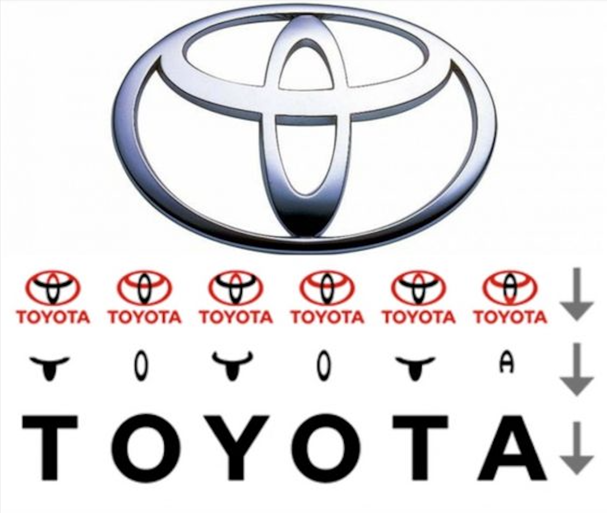
Let’s shift gears and take a closer look at the Toyota logo. At first glance, it may seem like a simple arrangement of ovals, but there’s more to it than meets the eye. The three overlapping ovals represent the hearts of the customers, the heart of the product, and the heart of progress in the field of technology and innovation.
The inner ellipses also form a “T,” and the entire logo subtly spells out “Toyota.” This name, inspired by the company’s founding family, Toyoda, was changed to Toyota because it requires eight brush strokes in Japanese (considered a lucky number) instead of the ten needed for Toyoda. This powerful emblem reflects the company’s dedication to its customers and its commitment to innovation and progress. It’s a powerful symbol of the company’s commitment to putting its customers first and driving towards a brighter future. So, as you admire the logo, appreciate the deeper meanings and the thoughtful design that drives Toyota forward.
Coca-Cola: A Refreshing Revelation
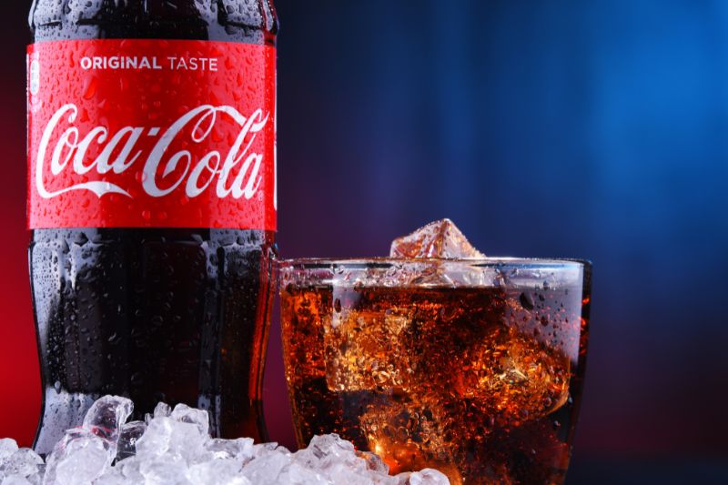
Ah, Coca-Cola—the world’s favorite fizzy drink. But did you know that there’s a hidden message lurking within its iconic logo? Take a closer look at the swirl of the letter “C.” Notice anything familiar? That’s right—it resembles the shape of a cursive “E,” subtly nodding to the beverage’s original ingredient: cocaine.
While Coca-Cola no longer contains this controversial substance, the hidden “E” serves as a reminder of the drink’s storied past. So, the next time you crack open a cold Coke, raise your glass to the hidden history behind the logo.
McDonald’s: A Golden Arch of Mystery

Golden arches—they’re practically synonymous with McDonald’s. But have you ever wondered if there’s more to these iconic symbols than meets the eye? Believe it or not, the golden arches weren’t always associated with fast food. Originally, they were part of McDonald’s architecture, designed to resemble the company’s signature “M” logo. Over time, the arches became so iconic that they became a standalone McDonald’s brand symbol. So, the next time you see those golden arches gleaming in the distance, remember the hidden history behind this iconic logo.
BMW: Driving Towards Enlightenment

Last but not least, let’s take a spin with the BMW logo. With its distinctive blue and white colors, it’s hard to miss this symbol of automotive excellence. But did you know a hidden message is encoded within the logo? The circular blue and white sections represent a spinning propeller against a blue sky—an homage to BMW’s origins as an aircraft engine manufacturer. It’s a subtle yet powerful reminder of the company’s heritage and its relentless pursuit of innovation and excellence. So, as you hit the road in your BMW, take a moment to appreciate the hidden meanings behind the logo.
Exploring Lesser-Known Logos
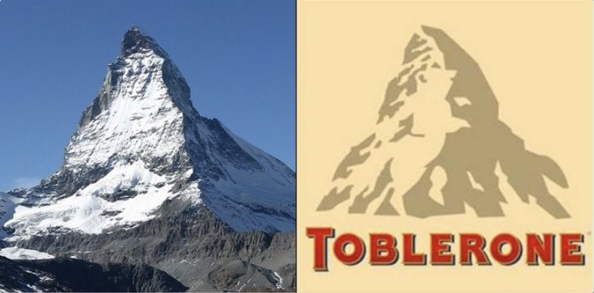
One lesser-known logo with an intriguing hidden meaning is that of Toblerone chocolate. Nestled within the mountain design of the logo is a hidden bear, a symbol of the city of Bern in Switzerland, where Toblerone originated. Bern is also known as the “city of bears,” and this clever inclusion pays homage to the brand’s Swiss heritage. So, next time you enjoy a piece of Toblerone, take a closer look at the logo—you might just spot the hidden bear!

